


Mega menus go beyond simple dropdowns, to provide more options and more advanced visual cues that help guide users through your site. They help to clearly differentiate navigation options with visual grouping–section titles, borders, colors, and images–like a mini-page within a page.
Most people associate mega menus with mega sites like Amazon or eBay, but there are plenty of good reasons to use mega menus on smaller sites, too. For example:
- Bars and restaurants can feature specials or highlight sections of their menu.
- Medical practices can offer easy access to long lists of service offerings or providers.
- Ecommerce sites, regardless of size, can guide users to the information and products that interest them most.
Here are some examples of mega menu designs that could work well for any sized business:
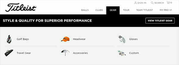
Titleist uses images to guide users to distinct sections of their site.

Keurig provides one-click access to a long list of product offerings.
At the same time, don’t fall into the trap of offering too many options–remember the goal is to guide users by simplifying site navigation, not to overwhelm users with too much information at once.
Point is, you shouldn’t shy away from mega menus, just because you’re not a mega business (yet). As with all-things-web, the more you can communicate visually, the more user-friendly your site will be. And happy visitors lead to higher engagement and higher conversion rates.
If you have questions about this topic, or other questions/suggestions about website development, brand development, or digital marketing, please send an email to [email protected]. We appreciate your feedback, and enjoy helping you make the most of your brand and your online presence.


